Creating a design for billboards on fast moving roads
If you drive or use public transport by road, you will notice companies taking the opportunity to grab your attention during your commute. With busy motorways taking up to 10,000 vehicles whizzing by during morning traffic, this is their chance to take your attention from a usually banal commute.
But does the message always get through? There are a number of factors to consider whether your design will be a success or a complete waste of time, effort and finances.
The following steps will guide you on how to get the most out of your road side advertisement.
Location location location
The layout of your design should depend on where the billboard is placed. There is a huge difference between vehicles traveling at 100km/h compared to those traveling slowly in traffic or built up areas. If you have the luxury of knowing where the billboard is placed, you now have an opportunity to break some of these rules. You can now look at adding more information (as the viewer will have more time to read it), or you could introduce a complimentary typeface such as something scripted, to help break up information or add emphasis.
If you are designing for one location, it is worth visiting the site during different parts of the day. During rush hour, or if it’s a built up area, traffic may be driving a lot slower. This is an opportunity to add more information to the ad, as there is time for the viewer to analyze it. If the billboard is located in a quick moving traffic area, careful consideration should be taken to get the message across as quick as possible.
Image used
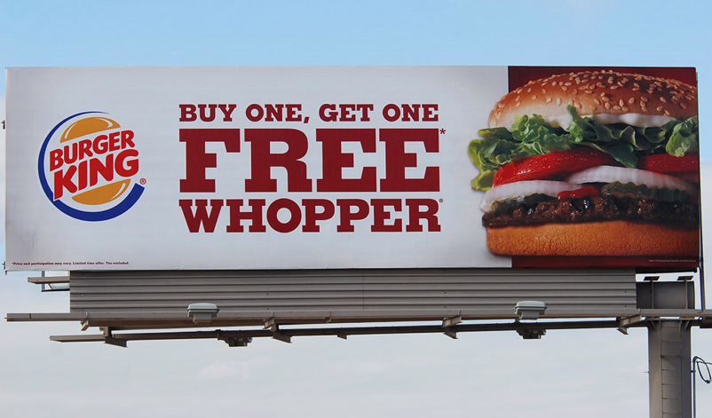
The style of photo used will obviously depend on the product being advertised. Along with the message and contact details, this will also only have seconds to be worked out by the viewer. For this reason, the image layout is crucial. For consumer products, there should be as much white space around the product as possible. To figure out what we are looking at, The human eye will scan around the edge of the object and then look directly at it to confirm what it is. This can be complimented with an image of the product in its habitat, but shouldn’t encroach on the product. Where a lifestyle product (travel or similar) is being advertised, an appropriate image will most likely be used across the full space. A large landscape image can be interpreted quickly, and will guide the viewer giving them an initial hint on what the ad is about. The message in this case needs to be quick, concise, and should be easily relatable to the image
Choose legible lettering
Capital letters are not necessarily better. People will read all capital word as a rectangle, a lower case letter is recognised quicker. If all caps are required, try to space them, allowing the reader to pick out each letter to understand the word quicker. This link points out the advantages and disadvantages of using serif or sans serif fonts. Avoid colours that clash, your eyes will not thank you and find it agitating. Choose contrasting background with main subject. Keep the subject simple and relevant. Should your ad be relevant to the same ad that runs on tv and radio? People commuting everyday may not listen to same radio station or tv Channel that the ad is run on. Therefore the ad is lost on them and you are wasting money. Keep the message self sufficient and self explanatory.
Call to action
Keep the call to action simple and memorable. Websites or phone numbers are the best for this, the former being easier to remember however.
Viewing a billboard 24/7
Motorways and roads are used day and night. There is no reason why a billboard should be made redundant when the sun goes down. In fact, rush hour takes place in the dark for 1/3 of the year in Northern Europe. If your billboard is not lit during these times, potential loss of earnings can be high. There are a number of ways to light your message
1. Spot lights. A spot light based at the bottom of the billboard spaced approximately 500mm apart can adequately illuminate a billboard. It will depend on the height of the board however and how powerful the lights are. This is important as in some instances, the light cannot be thrown far enough, resulting in a half lit billboard. When specifying a light solution, always enquire about the distance it can illuminate.
2. Trough lights. A great way to illuminate a sign or billboard allowing consistent light across. Low voltage LED light strips can be used, reducing power consumption and maintenance
Do you have an idea for a sign or want to illuminate your current signage. Contact info@elementcreative.ie or check out our examples at www.elementcreative.ie
Click here for Blog Mainpage